|
|
Post by Admin on Nov 4, 2015 4:33:02 GMT
Model Essay
The graph shows birth and death rates in Europe as a percentage of population from 1950 to now, and with a prediction for 2030. The bar chart shows the population of Europe in millions using the same time frame. According to the graph, the European death rate is more or less constant, starting at % in 1950 and dropping by just a quarter of a percent until now. It is expected that the death rate will rise slightly by 2020, back to its 1950 level. The birth rate, however, has been dropping steadily over the same period. In 1950 it was almost 24%, while by the start of the 21s century this had dropped by half. By 2030, it is predicted that it will be just 8.9%. The second chart shows a steady growth in European population from 1950 to 1990, when grow slowed to 2010. By 2030, the prediction is that population in Europe will have started to fall. Overall, while the death rate in Europe is constant over the 80 years indicated, the trend in terms of birth rate is downward and the European population is likely to fall. 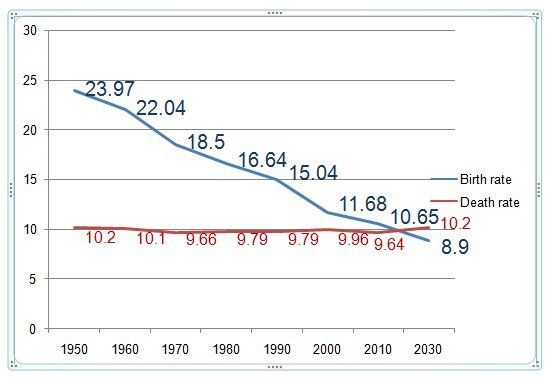 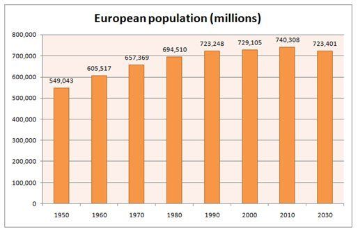 |
|

